Single Step vs Multi Step Forms: Which Converts Better?
In many cases, the drop in conversion has nothing to do with ads or targeting, but with a simple structural choice: using a single-step form when the form turns into a long form, or forcing a multi-step form when only a few form fields are needed.
A basic contact form or newsletter signup typically performs best on a single page. Users see everything at once, understand the effort required, and make quick decisions. However, when lead generation occurs on landing pages and the form expands beyond a few inputs, the same approach can harm user experience and reduce form conversion rates.
That’s where multiple steps change how people behave. A well-built flow with a clear progress bar, created in the right form builder, can make longer forms feel easier to complete. The questions don’t change — the way users move through them does. When structure matches intent, completion rate goes up and forms convert instead of being ignored.
When to Use Single-Step Forms (The 1–5 Field Rule)
Single-step forms work best when you're collecting basic information. If you need five fields or less, keep everything on one page.
Newsletter signups are the classic example you want a name and email address, maybe phone number.

That's three form fields total, no reason to split that across multiple screens - it would just slow people down.
The same logic applies to: Contact forms, Demo requests, Simple lead magnet downloads, Basic quote requests .When the information you need is straightforward, show it all upfront. People can see what you're asking for, decide if they want to proceed, and complete it in one go.
Advantages Of Single-step form
Best for Simple Tasks
Single-step forms handle quick actions efficiently. The kind of forms where someone lands, fills it out in under a minute, and moves on. These forms work because the commitment is obvious.
Three visible fields? People know exactly what they're signing up for. No hidden surprises, no wondering what comes next.
Speed and Transparency
The biggest advantage of single-step forms is transparency, which means that everything is visible immediately. When someone sees three fields on screen, they know it'll take 30 seconds to complete.
With multi-step forms, they're left guessing how many screens they'll need to click through. This transparency matters even more on mobile devices. Scrolling through five fields on a phone is straightforward.
Disadvantages Of Single step form
Can't Prioritize Leads
Every submission looks identical until you open it and read through manually. Someone who needs emergency service with a realistic budget sits in your inbox next to someone browsing with no timeline.
You're calling leads in the order they came in, not based on urgency or fit. That wastes time on low-intent prospects while high-value leads wait.
Breaks Down With Complex Forms
Once you hit 8-10 fields, single-step becomes a problem. The visual overwhelm kills conversions no matter how good your offer is.
Single-step only works when the ask is small. Five fields or less, you're fine. More than that and you need a different approach.
When Multi-Step Forms Outperform (The 6+ Field Rule)
Once you're asking for six or more pieces of questions, multi-step forms usually perform better. Breaking the form into logical sections makes the entire process feel more user-friendly.
Think about forms that need detailed information - loan applications, service quotes, comprehensive onboarding.
When you need name, email, phone, company details, budget, timeline, and project specifics all at once, that's a lot for someone to process on one screen. People see that wall of empty fields and immediately start questioning whether it's worth the effort.
Even if they want what you're offering, the visual overwhelm can make them close the tab. Multi-step forms change that perception completely.
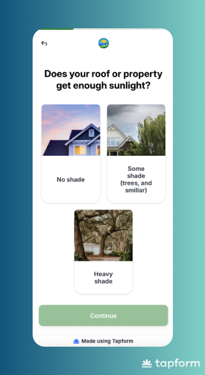
The first screen asks for contact info. The second covers project details. The third handles budget and timeline. Same questions, dramatically different experience.
There's also a psychological factor at play. Once someone completes the first step, they're more likely to finish the entire online form.
Advantages Of Multi step form
Managing Complexity
Multi-step forms are great at handling complex information collection because they create logical groupings.
Instead of dumping 15 fields on single page, you organize them into categories that make sense. Let's say you're running a home renovation quote form. You need: contact details, property information, renovation scope, budget range, timeline preferences - that's easily 10-15 fields.
Put all of that on one page and it looks like a government tax form. Break it into focused steps and it becomes reasonable:
- Step 1: Your contact information
- Step 2: Tell us about your property
- Step 3: What needs renovating
- Step 4: Budget and when you want to start
Each step has a clear purpose. People understand what they're answering and why it matters. That structure alone increases completion rates because the cognitive load is lower.
Mobile Optimization
Multi-step works better on mobile, and mobile probably makes up most of your traffic.Scrolling through 10+ fields on a small screen is frustrating.
Moving through focused steps with 2-3 fields each is easier. Progress indicators help too. A progress bar shows exactly how much is left, keeping people moving forward instead of guessing if they're halfway done.
Long form plus mobile traffic equals multi-step.
Disadvantages Of Multi step form
Takes Longer to Complete
Multi-step forms add clicks. Even collecting the same information as a single-step form, those extra screens add time.
For quick requests, this creates friction where none needs to exist. Someone wants to send a simple message? Making them click through three screens to do it feels excessive.
Higher Technical Complexity
Building multi-step forms takes actual work (unless you are using Tapform). You need progress indicators, data persistence, step validation, conditional logic. All of it needs to function without breaking.
Single-step is straightforward. One page, basic validation, done. Multi-step requires development skills or paying for form builder tools that handle this complexity.
Can Hurt Conversions If Built Wrong ?
Bad multi-step forms perform worse than single-step. Too many steps for basic information feels tedious. No progress indicator leaves people guessing. Asking for contact details too early ruins the entire psychology.
Someone completes three steps, hits an error that sends them back to step 1? They're done. Not trying again, not waiting for it to load.
Conversational Logic
Multi-step forms feel like conversation, not interrogation. Single-step dumps all questions at once. Feels like paperwork.
Multi-step asks one question at a time, mimicking natural conversation flow. What's your project? Click. When do you need it? Click. What's your budget? Click. People respond better to this rhythm.
Each step feels like progress. You can also adjust questions based on previous answers. Someone selects "emergency repair"? Next screen asks when they need someone on site, not generic timeline questions. The form adapts like real conversation would.
The Psychology of Completion
Multi-step forms tap into something interesting about how people approach tasks. Once someone finishes the first step and sees they're on step 2 of 4, something shifts. They've already started. Walking away now means all that effort was for nothing.
Progress bars make this even stronger. When someone sees 75% complete, their brain immediately calculates: "I'm almost there anyway."Single-step forms don't work the same way. Someone lands on a page, sees ten empty fields staring back at them, and decides it's too much work. They leave. There's no investment yet, so there's nothing pulling them to continue."
Cognitive Momentum
Each completed step builds momentum. First step is hardest. Second is easier because you've already begun. By step three, you're on autopilot. Multi-step forms engineer this deliberately.
Step 1 asks something easy - usually multiple choice. One click, done.
Step 2 asks something slightly more involved but still simple. Another win.
By step 3 or 4, you've completed multiple actions. Your brain shifts into task completion mode.
When step 5 asks for contact details, momentum carries you through.
The key is sequencing. Start with easy, low-commitment questions. Build toward questions requiring more thought or personal information.
Essential Technical Optimization for High ROI
Choosing the right form type is just the start. How you build it determines whether people actually complete it.
Add progress indicators. A simple "Step 2 of 4" removes the anxiety of not knowing how much is left. People abandon when they're guessing. Show them where they are and completions go up.
Save user input automatically. Someone closes their browser by accident? Their answers should still be there when they return. Nobody re-enters three steps of information. They just leave.
Track drop-offs by step. Most analytics only show overall abandonment. That's useless. You need to know which specific question makes people quit. If 60% bail at step 3, fix that question.
Use conditional logic. Someone selects "residential"? Show residential questions next. Don't make them skip through commercial options they don't need. Forms that adapt feel faster and keep people moving forward.