Lead capture page: Examples and best practices in 2026.
Getting contact information from website visitors is one of the most effective ways to grow your business. A lead-capture page does this by offering something valuable, such as an ebook, webinar, free trial, or newsletter, in exchange for contact details.
But some of the most popular and professional sites don't use this method; they collect contact information simply because of their strong brand and website trust. Because of trust, Users share their information, which is entered directly into the CRM and sales funnel.
To collect information from potential customers, you need a high-converting lead-capture page. The difference between your homepage and a high-converting lead capture landing page is focus. Your homepage serves multiple purposes, while a lead-capture page has one job: to serve as a lead magnet, boosting sales of your product or services.
Most businesses waste traffic because their landing pages try to do too much. Multiple CTAs, competing messages, and unclear offers confuse visitors, leading them to leave. A focused lead capture page removes this friction.
You don't need a big budget or technical skills to build lead capture pages that convert. Modern page builders make it simple with their page templates and easy to use drag and drop features.
To create a high value lead capture page, you also need to understand conversion psychology, best practices, and how to optimize it for your audience. In this way, you can boost your site's conversion rate and scale your business.
Real examples from Clearabee, Cuure, and Slack can help you learn which form fields matter (and which kill conversions), how to write CTAs that drive action, and where social proof makes the biggest impact. Small changes to headlines, button text, or offers can double your lead generation when you know what to test.
What is a lead capture page
A lead capture, also known as a lead generation page, is a single-purpose page designed to collect contact details from visitors.
Unlike your homepage or product pages that serve multiple goals, a lead capture page has a single focus - getting someone's:
- name
- phone number
- or other details you need
You need to give your website visitors something valuable in exchange; otherwise, they won't be willing to give you their information. That's the entire complexity of how lead capture pages work.
Lead capture page vs landing page
Lead capture pages and landing pages might sound similar, but they serve different purposes.
| Feature | Landing Page | Lead Capture Page |
| Purpose | Multiple goals (educate, sell, demo) | One goal: collect contact info |
| Focus | Flexible, various elements | Single offer + form only |
| Elements | Videos, testimonials, pricing, multiple CTAs | Headline, form, minimal content |
| Best For | Warmer audiences needing context | Cold traffic, building email lists |
A landing page is any page people arrive at after clicking a link. The goal depends on the page. Some sell products, others book demos or explain features. Landing pages are flexible and can do several things at once.
A lead capture page has one job: collecting contact information. It's made for one offer, one form, one goal, and nothing else competes for attention.
How to create a high-converting lead capture landing page
You don't need advanced technical skills or a big budget to build a lead capture landing page that works. The right tools and a simple process are enough.
Multi-step form builders make it easy to turn a basic web page into a lead gen page. TapForm is one of the simplest tools for this.
TapForm works with WordPress, Wix, Webflow, and other popular CMS platforms. You don't need to code - just embed it with a single line.
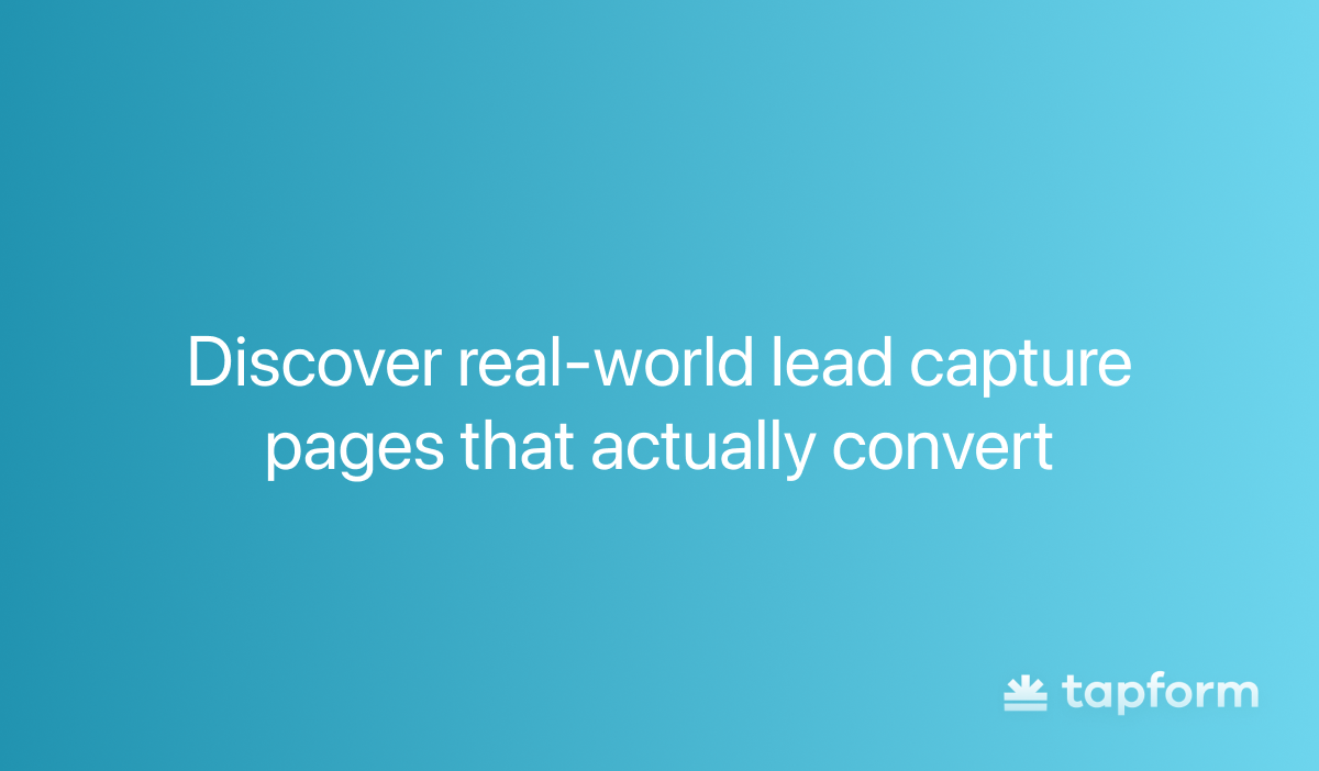
Lead capture landing pages examples
Real-world examples with best practices show you exactly how high-converting lead capture pages work across different industries. Some of the most popular industries for lead capture pages today are:
- B2B services
- E-commerce
- SaaS
Each industry approaches lead capture differently because each is specific.
B2B lead capture example
Clearabee is the UK's largest rubbish clearance company. They do same-day waste removal and skip hire for businesses nationwide.
They handle everything from regular bin collections to emergency clearances, all with their own fleet of over 100 vehicles.
Their business waste page is a solid example of effective lead capture. You see trust signals right away - the 4.8 rating from over 35,000 reviews is at the top before you scroll. The CTA buttons are also front and center.
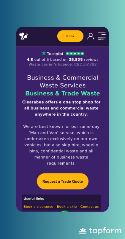
The first line under the main heading says they operate nationwide. They also highlight their same-day 'Man and Van' service, which makes them stand out.
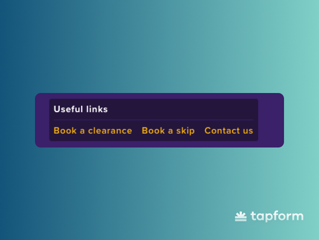
The 'useful links' section offers three quick options: book a clearance, book a skip, and contact them. This way, customers can choose what they want rather than being forced down a single path.
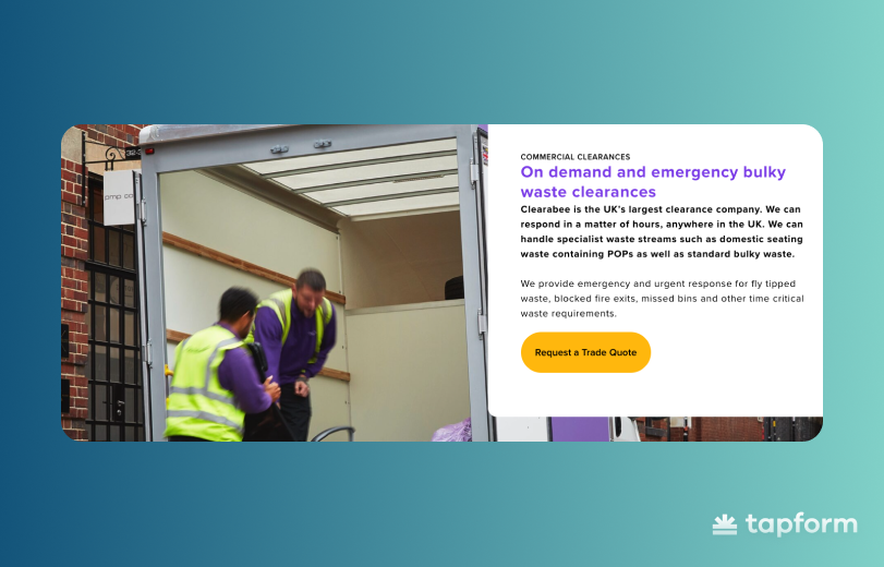
Scroll down, and you'll see their main services with real prices listed. This removes the biggest friction point - people want to know the cost up front.
They also include a photo of real company workers. This small detail makes the business feel more authentic than using stock photos.
Further down the page, you'll find FAQs that answer the most common questions. There are also more Trustpilot reviews available for visitors who need that final bit of proof before reaching out.
E-commerce lead capture examples
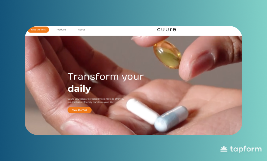
Cuure is a personalized supplement brand that takes a different approach to e-commerce. Instead of using 'add to cart' buttons everywhere, their homepage focuses on a quiz that captures leads and helps people find the right supplements.
This shows how e-commerce brands can collect qualified leads rather than hoping visitors will buy right away. As soon as you land on their page, there's a CTA button above the fold.
Click the button to go to a questionnaire. First, they collect your contact info—name, email, address, and country. This goes straight into their CRM, so even if you leave halfway, they can follow up.
Next, you go through a multi-step form. Each step asks about your health goals, challenges, and lifestyle. The questions feel engaging - you want to see what they'll recommend.
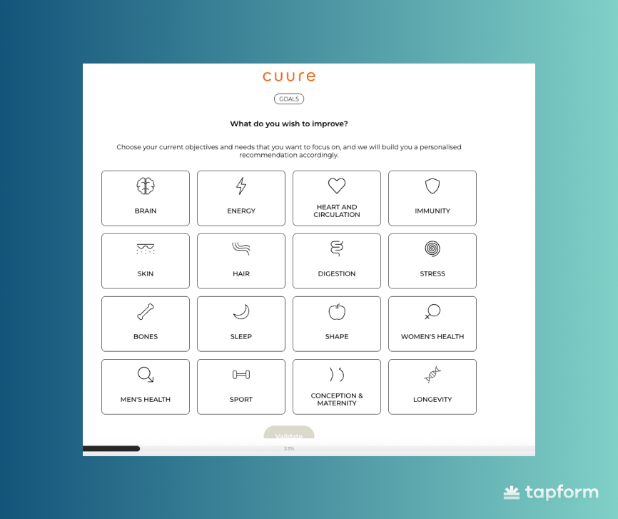
By the end of the quiz, Cuure can recommend products that fit your needs. The real value is that every lead they capture is qualified.
SaaS lead capture examples
Slack is what many teams use instead of email for internal communication. You get organized channels for different topics, direct messages, and integrations with your other tools - everything teams need to collaborate and share files in one place.
Slack's homepage is a good example of how SaaS companies handle lead capture. There's no long explanation of what the platform does or why you need it. The whole page is focused on getting you to sign up.
Two 'Get Started' buttons are right at the top. There's also a smaller 'Find your plan' link for people who want to check pricing first. This covers different visitor needs without distracting from the main signup action.
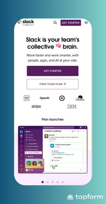
Right below those buttons, you see company logos - GM, OpenAI, Target, Paramount, Stripe, IBM. This is the trust section. The logos aren't explained or hyped; they just show that major companies use Slack, which answers the credibility question right away.
You don't have to scroll to see product animations. Short clips show the interface in action - channels opening, messages sent, integrations connecting, AI features running. You get a real sense of Slack without watching a demo or reading long descriptions.
The page works because it removes friction at every step. Trust signals are present but don't detract. CTAs appear in several places, so you can sign up whenever you're ready.
Best practices for high-converting landing pages
When you look at Slack, Cuure, and Clearabee, something becomes obvious pretty fast. They're all using the same best practice landing page conversion strategies. Different products, different industries, but almost identical page structure.Here's what shows up on all of them:
- Compelling headline
- Supporting subheadline
- Lead capture form
- Call to action (CTA) button
- Engaging visuals
- Social proof
Compelling headline
Your headline has seconds to communicate value. Visitors land on your page and decide whether to stay or bounce based on what they read first. Make it specific. Tell them what they're getting, not some vague promise.
Clearabee's headline "Business & Commercial Waste Services" does exactly that. It's clear. You know what they do the moment you see it. No clever wordplay, no mystery - just straight to what matters.
Supporting Subheadline
Your subheadline expands on the headline. This is where you add context or explain how you deliver on that promise. It needs to flow naturally from what you said above, not jump to a different topic entirely.
Keep it short. One or two sentences maximum. The subheadline connects your headline to everything else below it. That's the job.
Lead capture form
Every field in your lead capture form should have a reason to be there. Ask for what you need right now, nothing extra. Name and email? Makes sense. Phone number, company size, job title? Depends on what you're selling and how you follow up.
More fields mean fewer submissions. Fewer fields mean more leads but maybe lower quality. There's no universal answer here. If you're selling enterprise software, you might need more info upfront. If you're building an email list for a blog, keep it minimal.
Call to Action (CTA) Button
Your call-to-action button should clearly state what happens when someone clicks it.
Slack uses "Get Started" which is simple and clear. They also add a smaller "Find your plan" link for people who want pricing details first. Two different CTAs for two different visitor intentions.
Make your button stand out visually. If your page is long, put the CTA in multiple spots. Don't make people scroll back up to convert.
Engaging visuals
Visuals explain things faster than paragraphs of text. Product screenshots, demo clips, simple diagrams - these work when they support your message. Stock photos of people in meetings add nothing. If you're showing people, use actual photos of your team or customers.
Slack shows animated demos of its interface. You see messages, channels, and integrations moving in real time. Clearabee puts actual company workers on their page instead of stock images. Small detail, but it makes the business feel real. Use visuals that reinforce what you're saying, not just decoration.
Social proof
Every visitor wonders the same thing: "Has this worked for other people?" Social proof answers that. Customer logos, testimonials, ratings, and user numbers - all of this builds trust and reduces risk. Just make it real and specific.
Clearabee shows its 4.8 rating from 35,000+ reviews right at the top. Slack displays logos from GM, OpenAI, and Target.
When you add testimonials, include real results. "This saved us 10 hours per week" beats generic praise like "Great product!" every time. If you're showing company logos, pick ones your audience actually recognizes. Dropping IBM's logo doesn't mean much if you sell to local restaurants.
A/B Testing
Your first version of a lead capture page won't be your best. A/B testing shows you what actually works with your audience.
A/B testing means running two versions of your page simultaneously. You change one thing -the headline, button text, or form length - and split traffic between both. Whichever version converts better wins.
Test one element at a time. If you change the headline, form, and images all at once, you won't know which change made the difference.